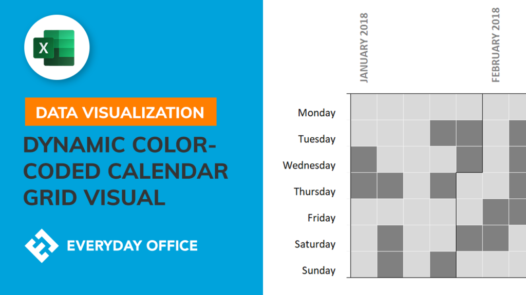
Building a Color-Coded Calendar Grid in Excel

People are always badmouthing Excel and working in various new and powerful data visualization tools. In this video, we duplicate the visualization technique described in this post to the subreddit /r/dataisbeautiful (https://www.reddit.com/r/dataisbeautiful/comments/a7uq76/the_precipitous_decline_in_white_house_press/) with Excel. The original graphic was built using R, but this is created entirely using Conditional Formatting.


